
Our Magazine History
July 2012 will mark the tenth anniversary of the first edition of Star ACT sourced, compiled and presented by Neil Mansini as editor. To mark this occasion we will look at the history of our magazine, beginning this month, with the period following the formation of the club. For this I am extremely grateful to Lindsay Miller who researched his own records, our library records, and contacted a number of other long time club members to gather the information for this account.
Part 1
In the Beginning
The Club was created in 1976 following an advertisement placed in the Canberra Times of 1 May 1976 by Terry Birmingham, who became the first President of the Club. The first club publication was described as a magazine and a copy is held in the Club’s library. It is marked “5/76”, so no time was wasted in getting the Club operating after the advertisement. In this, the development phase in the clubs history, another partially concurrent club publication termed the “Newsletter” was also produced.
The first year

That first edition, “5/76”, of the magazine consisted of one A4 page folded once and printed as four A5 sides. The front page showed the image of a Mercedes-Benz radiator grille surmounted by a star. The back page contained a “List of Prospective Members as at 25 May 76” which also identified office holders, but made no mention of an editor.
The second issue of the magazine was clearly dated July 1976, and now contained three A4 sheets printed as 12 A5 pages. Terry Birmingham stated “Our P.R.O.(Public Relations Officer), Peter McLean has a dream of printing a multi-page-magazine and will not go to press until I contribute something towards his goal. …” So it seems that Peter McLean had become the magazine’s editor.
The third issue of the magazine, dated “October 1976” and having the same structure and size as the second, gave an insight to the joys of editing: “As you read on through this magazine, please keep in mind that most of the articles and items have been read and edited so brilliantly, by having been read and re-read in front of a specially selected audience of hysterical, laughing and applauding members of the editor’s family, in fear of either their housekeeping or pocket money.”
The first issue of the newsletter, titled “Newsletter No 1”, is undated but is signed by Bruce Macumber as President, and contains the following initial paragraph: “In an endeavour to improve communication within the Club, it has been decided to publish a social newsletter. It is not intended to replace the magazine but rather to “fill-in” between issues. As you may, or may not be aware, we have a problem with publication of the magazine from the printing side of things and this unfortunately has delayed publication. The problem is being worked on however, and it is hoped to have an issue out early in the New Year.”
That next issue of the magazine was the fourth issue, dated February 1977. (see picture at left) This would date Newsletter No 1 as December 1976. (That Newsletter also forecast the publication of the results from the Concours d’Elegance (4 December 1976), thereby further defining its date as mid to late December). The magazine had now grown to four folded A4 pages.
Newsletter No 2 is also undated but the content suggests it was mid March 1977. It also contains the statement “It has been decided, therefore, to summarize details of our meetings in both the newsletter and the Magazine.”
Newsletter No 3 is also undated but the content indicates it was issued during April 1977. It also forecasts an improved magazine, as follows: “Plans are progressing well for the publication of our new-look magazine …” , and then “Steps are currently being taken to have printed a new cover for our magazine. A “proof” of the new cover has been printed and looks very good. It is hoped that a magazine, the last for our first year, will be published in mid-June and will have the new cover.” There is no mention of who the “editor” was for these newsletters, but it would presumably have been either Bruce Macumber or Peter McLean.
The Improved Magazine

First issued in July 1977, the new magazine sported a hard cover, coloured blue with a stylized design of five white overlapping three-pointed stars in circles. It was professionally printed and contained four double-sided pages inside the covers. The introductory “President’s Note” stated: “As you will notice our new magazine is in this issue, being supported by four sponsors. Such support means that we no longer have to dip into membership fees to print our magazine and therefore our money can be channeled into other areas.” This was the first occasion where sponsorship was shown in the Club’s publications, and there was no mention of an “editor”, but Peter McLean was still listed as Public Relations Officer.
The next issue, August 1977, listed Noel Misson as “Magazine Publisher”, and his initials are at the bottom of an “editorial” titled “From the Coffee Table”. This appears to be the first occasion where the club had an editor that did not have public relations or other roles. In his editorial he said “… our magazine is developing into a rather sophisticated production. Many thanks go to our advertisers who have provided us with the necessary finance to have our magazine printed professionally and published monthly.” There were nine sponsors in this issue.
In the next (September) issue, “From the Coffee Table” drew members’ attention to a revised layout of the magazine, explaining that, to reduce costs, it was “… necessary for us to do our own “setting up”, …” rather than have the printer doing it.
Monthly issues continued until November 1977, all with Noel Misson as the “Magazine Publisher” (editor), and the magazine having 12 internal pages. If the Club library holdings are complete at this point in time, it appears there was a minor hiatus with no December or January editions, the next series being February through to April 1978. The style of the magazine continued as for the September issue.
We then have an apparent larger hiatus, with no magazines held by the library until November 1979. (see picture previous page) That edition is much heavier and as an indication as to why, it welcomes readers to the “Fourth Annual Concours d’Elegance of the Mercedes-Benz Club of the A.C.T.”. The President at this stage is Bob Sobey, and the second signatory to the welcome is Noel Misson, suggesting but not stating that he is the “editor”.
1980 and 1981

The Club library is “silent” regarding 1980, the next edition of the magazine available being a very different item. Apparently issued October 1981, it has a cover picture of a Mercedes-Benz competition racer (Fangio or Moss) and a title of “6th Annual Concours d’Elegance”. The content is wider than the concours, shows advertisements for ten sponsors one of which is the Printer. Bob Sobey, recalls being the editor of this issue.
A New Pattern – 1982 To 1988
Assuming the holdings of the library are complete, then a new pattern emerged in 1982. Monthly or bi-monthly Newsletters were used for regular communication with members and an annual concours magazine was issued at the end of the year. In 1982, there are newsletters for April, June, July, August, September, October and December. They range from single A4 pages to three A4 pages stapled. Bob Sobey was President and also the newsletter editor and recalls printing many of them in his loungeroom. The 1982 edition of the magazine is focused on the “7th Annual Concours d’Elegance” held on 21 November at Hall Showground, but has wider articles as well. There are 15 sponsors listed.
A similar pattern of irregular Newsletters and annual concours focused Magazines continued till 1988. Bob Sobey continued as editor and recalls a little of how things were done. “We were talking at dinner about the photo copier in the front room and sitting up late at night printing the magazine, collating and putting the blue binding on the spine. In those days we had a “Tandy” computer that was really only a word processor. All the ads etc. were designed by us and then cut and pasted into the next copy. Photos were just photocopied after being stuck in the page. A lot of the lettering was taken from magazines etc., a bit like a ransom note! When it came time to put the magazine together we would get other members over and sit around collating, putting into envelopes and fixing the address labels. A very social event.”
The library lacks a 1988 concours magazine. Bob Sobey was posted to Norfolk Island in August 1988, and the September newsletter calls for contributions for the Magazine to be sent to Beb Fox. We thus assume that an annual magazine was prepared in 1988 with Beb as the editor.
1989
There are newsletter issues for most months of 1989. The August issue had a “quick note” including a statement that the newsletter was now being printed by Allards Distributors. All newsletters were issued by the Social Secretary, John Green. The concours magazine for November 1989 was no longer professionally printed and was probably printed and stapled by Allards.
A Regular Magazine 1990 to April 1995

With the April / May edition, 1990 marks the beginning of a larger, more substantial, heavier covered style of monthly magazine (still titled “Newsletter”). This change appears to be related to mid-term committee changes where John Green is listed as the President and Ray Zak as the “Newsletter Editor”. The issue had 16 internal sheets printed both sides (32 pages), the content being mostly articles photocopied from other journals. There are two sponsor advertisements. The magazine in this style saw the end of the “flyer style” newsletters.
This new approach to the regular magazine continued, with similar style and specification, page numbers varying between 12 and 50, until September/October 1992. The cover photo remained the same for all issues – a black/white slanted photo of the top of a Mercedes-Benz radiator shell surmounted by its star.

From August 1991, the cover photo changed to the badge emblem – the star surrounded by the words Mercedes and Benz and the laurel wreaths – and the title changed to “Official Newsletter”. The 1991 concours edition grew to 56 pages and the November/December 1992 (concours) edition had some 80 pages!
There were a number of changes of editor in the next few years. Ray Zak retained the editorial role after he became president in August 1992. Tim Smith edited the 1993 editions, through to February 1994. Bob Sobey then once again took up the editor’s role in May 1994. It was at this point that the magazine was given its current title “Star ACT”, but retaining the description “Official Newsletter”. The October/November 1994 to April 1995 editions listed the editor as “Gone to Haiti” – another posting for Bob Sobey. From memory Ray Zak resumed the role of editor in his absence.

The 1990 to April 1995 magazines were produced entirely from within Club resources – by photocopying articles and then photocopying all pages using the Club’s photocopier, groups of members meeting periodically to assemble the stock of magazines (picture grown men and women walking in single file around a table placing pages in sequence upon a number of growing piles which became magazines) and then enveloping and posting them. During this period the covers were soft using the same weight of paper as the rest of the magazine. The cover pictures used varying Mercedes-Benz emblems or different pictures for each edition. (see photo of April 1994 as an example)
A More Professional Looking Production From May 1995
May 1995 saw the magazine production moved to a professional printer, with a generally pleasing outcome. The content included 17 sponsorship advertisements. The cover remained at the same paper weight as the other pages, and the cover picture reverted, from June 1995, to an earlier emblem. The concours editions were now 32 pages in October 1995 and 44 pages in August/September of 1996.
The editor was not unidentified in the magazine until the August 1995 edition which listed Ray Zak as the first name in the “Magazine Group”. From October 1996 to March 1997, Elysebeth Fraser-Price was the editor. Elysebeth came into the Club specifically to cover the editorial position on the committee and introduced a seasonal theme for the Christmas edition, but otherwise the magazine style remained unchanged.

From April 1997 to August 1998, the editor was Susi Sager, and the pleasing style and production remained unchanged, with monthly issues, and the cover also was unchanged except for the Christmas 1997 edition, showing the same seasonal theme as the 1996 edition. For her good work as editor, Susi was presented with the Club Woman of the Year award at the AGM in August 1998, not long prior to the departure of the Sagers to live at Tuross Head.
Rob Gill from September 1998 to March 2001
Rob Gill took over as editor in September 1998, and his professionalism as a jounalist soon became evident, with his witty and punchy titling of articles displaying flair and imagination, with cover photos relevant to each monthly issue, and with “teasers” displayed on the cover indicating feature articles. Rob continued in the role until March 2001, giving “Special Notice” in that issue titled “Editor wanted – must be clean, cheap and quick”.

It is interesting to note that from September 2000 each issue listed four “Contributing Editors”, one of whom was Neil Mansini who was to become editor at a later date.
Part 2
The Digital Age

In tracing the history of our magazine last month, we concluded in March 2001, when editor Rob Gill gave a “Special Notice” in that issue titled “Editor wanted – must be clean, cheap and quick’.
Daryl Maddern’s “President’s Report” in the April 2001 issue, lamented the loss of Rob Gill due to the growing pressures of his other journalistic work. This simple statement didn’t really reflect the significant effort involved in ensuring that the club continued to have a regular monthly magazine. Daryl’s daughter Camilla had graphic arts and advertising industry training and access to professional computing equipment and software. She also had a good relationship with a newly established printing firm in Braddon. Camilla was able to take over production of the magazine at short notice and further develop its presentation.
And, perhaps as a sign of the future, Camilla lived in Adelaide for most of this period. Text and photographs were sent to Camilla both electronically and by post (reflecting the evolving nature of club members’ photographic and text creation facilities). Once Camilla had compiled the material into a magazine layout this was recorded on CD and posted to Daryl who handed it to the printing company and undertook any necessary further editorial tasks.
This arrangement continued until the December 2001/January 2002 issue when Neil Mansini was appointed editor and took over most of the work that Daryl had previously performed.
Neil Mansini Becomes Editor
My involvement with the club magazine started shortly after I joined the club. I made the occasional contribution to the magazine, usually a short general interest item. This grew to be a monthly column. When the then editor Rob Gill resigned, I looked at the criteria he identified for the editorial position: “must be clean, cheap and quick”. Over the years, enough people have called me cheap to make me confident I qualified in that regard. And I figured that I could bluff the other qualifications, so I applied.
In the period from the end of 2001 till June 2002, the editors job was as described above. As a former systems auditor I tend to be conscious of systemic problems. One thing that did concern me was that the club did not have a fallback position, in the event that the people preparing the magazine had to resign at short notice. As a good public servant, I used Microsoft Word to prepare my reports and the material I wrote as manager. My experience with Word was limited to writing, and occasionally inserting a few pictures or diagrams. But I recognised that it should be possible to use that software to layout a magazine that looked structurally similar to what was being produced.
I went ahead and explored this possibility. After a couple of versions I had developed a framework that was viable as an alternative magazine structure. The Committee agreed, and it was decided that from July of 2002 the editor would prepare the layout for the magazine as well. The Development Process
As part of the development process I had to work out how to lay out a magazine. I’m an accountant, not a journalist or graphic artist, so this would require some research. I took a look at the magazines I had lying around the house. These included American and Australian motor magazines, old Playboys, and a range of others on varying topics (all boy magazines). It was quickly apparent that all the commercial magazines I sampled had a structure, and the structure was much the same in all of them.
Most magazines started with the contents page, publication information, editorial content and short items. This was followed by the general feature articles, then specific subject items clustered in a group. (In the case of Road and Track for example, these specific subjects would include motor racing and technology). The back of the magazine contained small size advertising and other stuff that didn’t fit in anywhere else. Then there was the issue of readability. In all the commercial magazines I sampled, one common font was used throughout the magazine, with the exception of Article headings and in graphics. Because of the cost of printing and postage, magazines generally use a font size of around 10 point and preserve readability by using columns. I prefer the Arial font (which I understand is essentially the same as Helvetica) because it does not have decorative elements that confuse the eye.

I understand that a consistent font and layout increases the familiarity and comfort that the reader has with the magazine. Interestingly, as I was writing this, there was a documentary on television about Hugh Hefner, the editor of Playboy magazine. At one point Hefner commented that a magazine should be like an old friend, but with something stimulating to say on every meeting.
Quality Assurance
Initial experience showed that too many errors were not being detected and corrected before a draft layout went to the printer. Therefore, development of quality control procedures was a priority in the first few months of my period as editor. The most basic quality control is to electronically spell check the material before it goes into the layout and then spell check the whole magazine once completed. To make things easier both English and American spellings are accepted as correct (I don’t necessarily know the difference anyway). Spell checking software is not perfect. It will not, for example, tell you if you are trying to kill a vampire with a steak in the heart. But it is a big help.
A checklist was also developed to ensure that everything was included in the magazine, and that all the necessary changes (like the date on the cover) were made.
It is a good idea that the editor does not add errors to other authors work. I try and avoid making or suggesting editorial changes, but if I do, I refer them back to the author for approval.
How the Magazine is Produced
If you are familiar with Microsoft Word you probably recognise that the magazine starts as a framework document, that I label the magazine master. This is a 16 page Word file that contains the name and club logo on the cover, the advertising on the inside front and the back covers, plus the general content of pages 3 and 4. Also, there are page headings for the Calendar, Committee, Presidents, Notes, CACTMC and Stuttgart pages. Further on there are the titles for the motoring, tech torque and starmarket pages.
As well, there are separate master documents for the calendar, the committee list and the starmarket adverts. These separate master pages were initially introduced for ease of working and to allow me to start laying out magazines several months in advance.
Material for the magazine comes from committee members, who supply regular items like the various reports, plus information on things like new members, calendar changes and items in the Notes section. You and I as members contribute items which are usually feature or technical articles. Daimler Media is the source of most news. Sometimes I reproduce items that have appeared in other club magazines or from other sources. And finally, and very importantly, there are the humour and other small items, contributed by members. These add interest and help fill the spaces inconveniently left over by the larger items.
The Daimler Media website (media.daimler.com) is a very good resource for anyone researching anything to do with MercedesBenz or any other Daimler product (Maybach, smart and the various truck brands). The site covers not just current products, but contains material going back to the birth of the automobile.
I read through all text items, correct any errors and sometimes suggest changes that may improve the article, to the author. Items from Daimler Media are usually press releases. These are, how shall we say, generous in their praise of the subject. After the extraneous material is edited from the press releases they are usually around half to two thirds their original size. However, the material still has to sound as if it comes from Daimler. Your editor cannot appear to be commenting on a vehicle he has not even seen, let alone tested. Daimler technical articles receive little or no editing.
All material that is a combination of text and photos is prepared as a separate Word document. Photos have to be cropped and resized to fit into the layout. This is usually done using Irfanview photo editing software (which you can download for free). These completed layouts are then pasted into the master Word document which now has a title like july master.docx
Once all the planned items are in the master, the index has been completed, and the checklist shows that all the necessary work has been done, the magazine is essentially finished. The whole document is then electronically spell checked and visually scanned for any obvious problems. The final action is to convert the Word document into the pdf format used by the printer. The magazine is now between 10 and 20 Megabytes of zeros and ones and can be emailed to the printer in Fyshwick via a service that handles large files.
The Unsung Heroes
Because the editor no longer lives in Canberra, once the magazine has gone to the printer, the magazine group takes over. A proof copy of the magazine is prepared by the printer and sent to our proofing officer Lukas Tan. Lukas checks the proof for potential quality issues like poor photographic reproduction or missing or jumbled text. While doing this he may also detect errors like the vampire with a steak in the heart. Errors detected at this point may incur a charge by the printer to correct, so we generally only correct those errors that affect the accurate understanding of the text.
The copy of the magazine that you receive may vary slightly from the proof. Photos, for example, may look a little too light or too dark. This is generally an issue with the mechanics of the printing. Once the magazine is printed, our hard working distribution volunteers, John Simsons and Lyn Reynolds become involved. As does our Membership Secretary, Keith Millar, who arranges the address labels. John and Lyn collect the magazines, put them in envelopes, along with any inserts, and organise the posting.
Evolution over 10 years
Looking back at the July 2002 issue of Star ACT, some characteristics of the magazine would still be recognisable to anyone reading the latest issue. The cover has changed a number of times over the last 10 years but the name on the cover still uses the same font. And the style of the title headings for Straight from Stuttgart, the motoring page, the CACTMC report, Tech Torque and Starmarket, have remained the same even though the actual names may have changed in some cases. The cover is usually the most recognisable change in a magazine. In July 2002 we started off with a cover in the style pioneered by Rob Gill, with a half page photo a little below centre and identification text above and below it. While the photos varied in size, this general style remained till May 2004.
In that month we featured our first color cover. With the anticipation that some members may wish to keep or even frame the cover photos, we reduced the text on the cover to the minimum, with just the name and the date in the top corner. Alas, the cost of printing a color cover soon varied from initial estimates, and it became uneconomic to continue this feature. However, the grayscale cover photos that followed continued to occupy most of the page, with just the name, date and club logo in a band across the top.

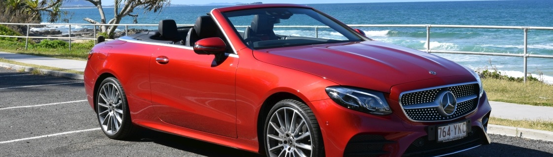
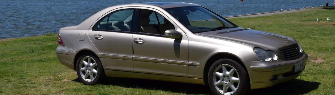
With sponsorship arrangements in place, we celebrated the new financial year in July 2011, with the current style of color cover (photo left). Again it was considered desirable to minimise the amount of text on the cover, to allow members to keep the photos, if they so desired. The changes in cover style over the years have necessitated variations to the layout of the first half dozen pages. But a design I like particularly is the Committee page. This design was introduced in November 2002 and has remained unchanged, except for the names and photos, ever since. The decision to include photographs of the committee members was very much an initiative of the whole committee, with David Coward, a photographer, providing the final professional touch.
Communication
STAR ACT is an important element of our club. As we saw from the history of the magazine in part 1 (last issue), it was established to allow the committee and event organisers to communicate with the other members. This remains a key function, but just as importantly the magazine is a place where members can communicate with their fellow enthusiasts.
It is the contributions of members, providing helpful information or relating other things of common interest, that makes our magazine an enjoyable read and a point of reference.
 Because I didn’t write enough to fill up the whole page, you get to see a picture of me. This photo was taken by David Coward back in 2002, when we all got our pictures took for the Committee page. I don’t have a current picture of myself, but I don’t think I have changed much. Just imagine the person above with more gray hair (and less of it).
You wouldn’t want to see my passport photo. Like they say, if you look like your passport photo, then you are either on your way to the morgue, or desperately in need of the holiday you got the passport for.